

Limoncello
Packaging Design
Client: Paul Doran
Industry: Manufacturing
Services: Food & Beverage
Year: 2026
Brief
Design packaging for a homemade limoncello that reflects the spirit of a traditional family recipe while capturing the drink's growing popularity among contemporary audiences. The packaging needed to celebrate its local origins, using lemons sourced from a family lemon tree in Mt Martha, while presenting limoncello in a fresh and modern way.
Process
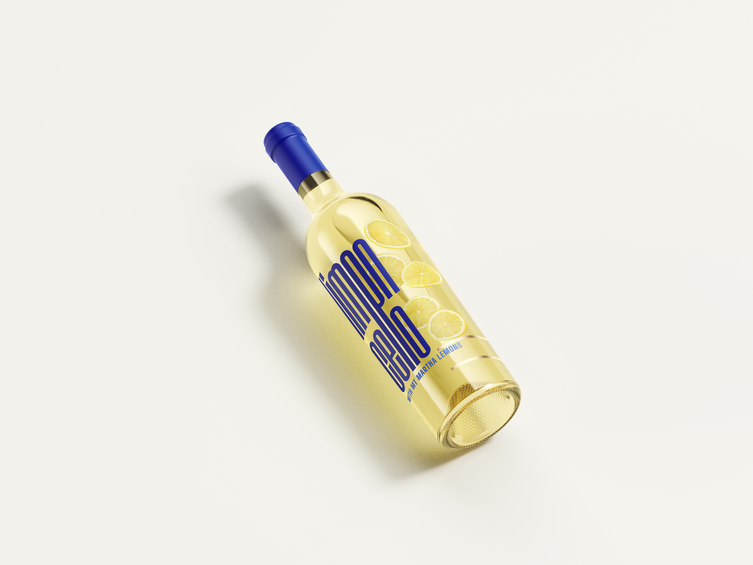
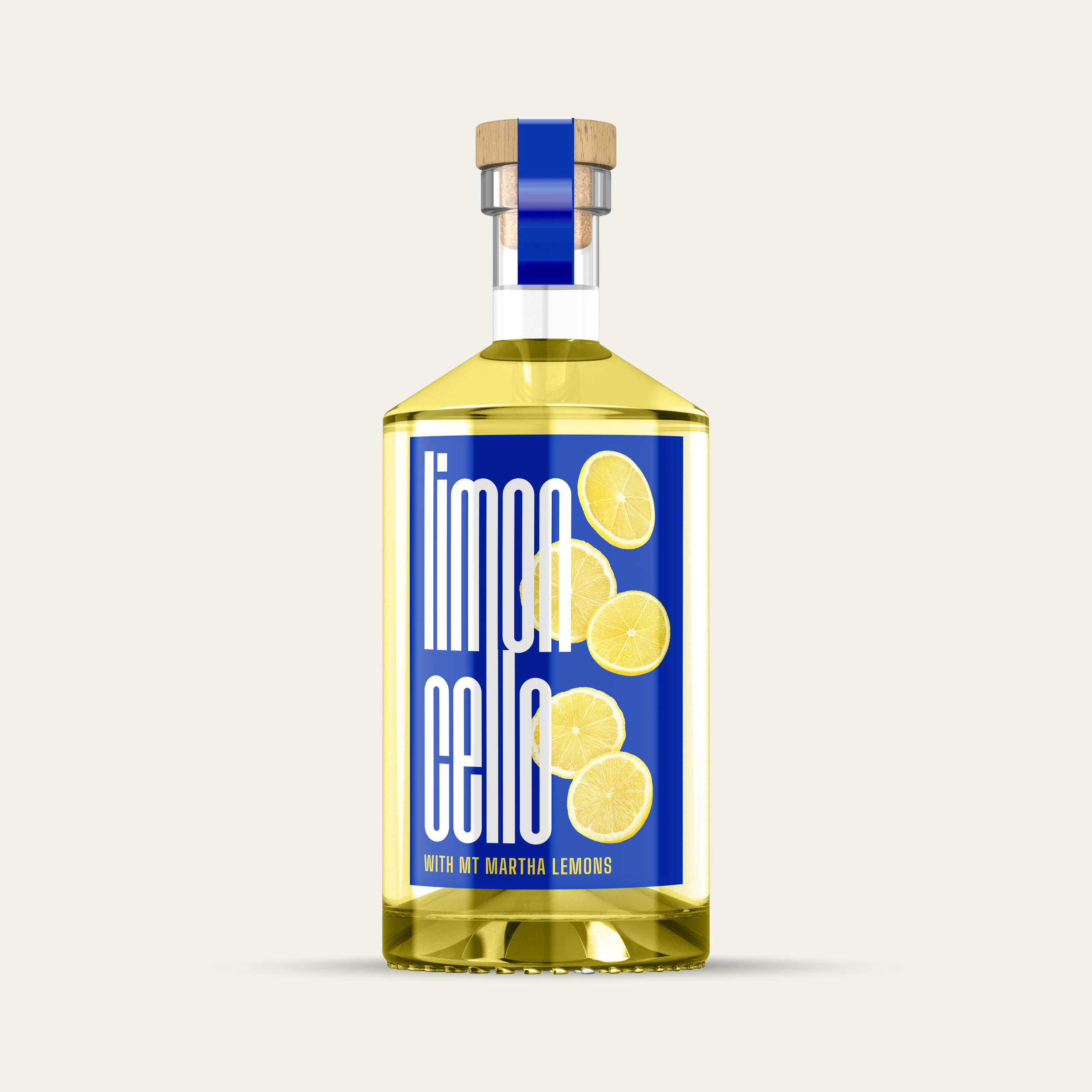
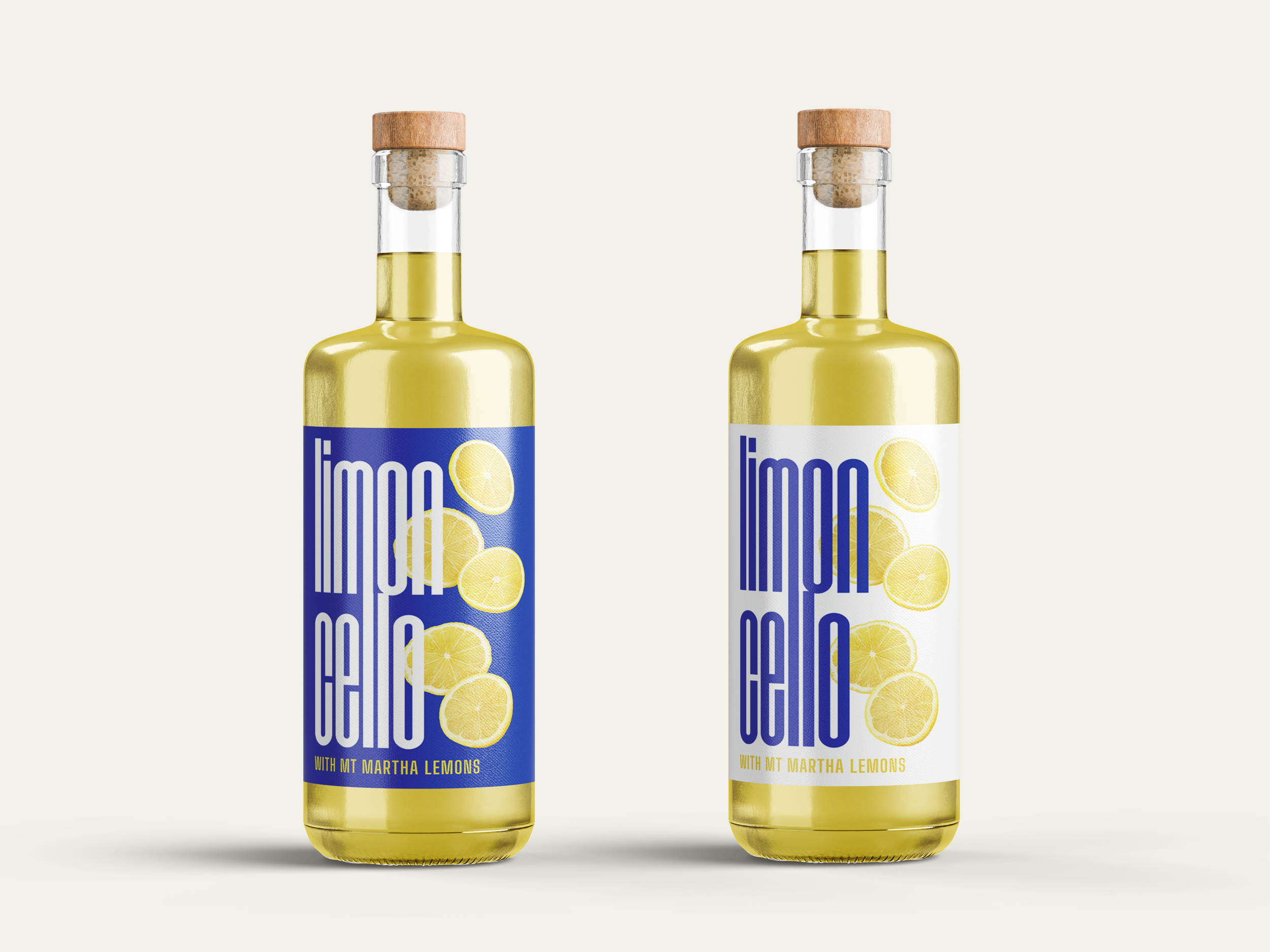
Drawing on influences from contemporary Italian graphic design, the design explores simplicity, clarity, and confident visual restraint. Thin linear details, bold typography, and generous negative space were used to move away from the ornate styling often associated with traditional limoncello packaging. A cobalt blue palette was selected as a reference to the Mediterranean landscapes and coastal colours synonymous with Italy.
Outcome
The final packaging reinterprets limoncello through a contemporary lens, balancing family heritage with modern design principles. A bold cobalt blue palette, minimalist layout, and refined typography create a distinctive presence that reflects the growing popularity of limoncello among younger audiences and the resurgence of drinks such as the Limoncello Spritz. By combining local ingredients from Mt Martha with influences from modern Italian design, the packaging celebrates both tradition and reinvention.